
In the previous article, we have explored how to use whitespace to improve your PowerPoint presentations. Let's now focus on typography, i.e. how type is presented, its positioning, function and - most importantly - its readability.
Sure, graphics are important in your presentations, but it is text content that is the king. We use typography to better convey our ideas, create mood, and evoke emotional response from our audience. As it is a very important element in your presentation, let's run through a few important rules to keep in mind when deciding on your fonts.
Choose your fonts wisely
These days, there are a lot of fonts to choose from and sometimes it feels good to let your creativity go. If you want your presentation to stand out and you have a good feel for typography, go for it. Just remember to be consistent throughout your presentation and don't use more than 2-3 fonts in the same document. Also, keep in mind that your fancy font might look great but, if not installed, it will not display properly when the presentation file is opened on a different machine. So when presenting on someone else's machine always carry the font installation files with you.
If working with fancy fonts feels a bit daunting to you, consider using the standard sans-serif fonts, such as Arial, Verdana or Calibri. These have been designed for screens and with a focus on readability at any size, so they will always work well in your presentations. If you are set on using serif fonts (such as Times New Roman or Georgia) use them only for headings, but not for the body text. Serif fonts have been originally designed for print and are harder to read on the screen, especially at smaller sizes.
If there is one or a selection of fonts your company typically uses, stick to them. It creates brand unity and keeps things consistent.
Below is the handy list from Buffalo 7 outlining the which system fonts work which operating systems.
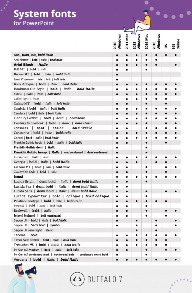
Image source: The only 5 presentation fonts you’ll need
What is font personality?
Did you know that fonts have personalities too? Fonts can convey the level of formality and the feel of your message. Do you want your presentation to go down as formal? Strong? Edgy? Fun? Bruce Gabrielle, a PowerPoint guru, summerises it nicely:
"So which font should you choose? That’s like asking which outfit you should wear. If you’re having an important business meeting, wear the brown suit. If you’re speaking at the TED Conference, wear jeans and a turtleneck. Going out on a date? Wear that flirty little black dress. Your font choice should be a conscious decision based on the image you want to project."
Bruce put together a handy table categorising font personalities. If you are still not sure get a feel for it by watching this SlideGenius video.
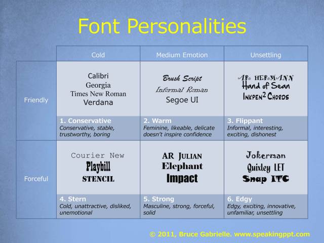
Image source: The #1 Best Advice for Choosing PowerPoint Fonts
Titles should be big, and your main text should be readable
It may sound obvious, but this rule is often overlooked. Ultimately, your font sizes will depend on the final aim of the presentation. If the presentation is going to be printed and read you can get away with smaller body size. Make your heading stand out by using a larger font, with your body text being not much smaller than 18 point size.
Below are some guidelines for you:
- Minimum font size for body text and bullets: 18 points
- Preferred font size for body text and bullets: 24 points
- Preferred font size for headings or titles: 36 to 44 points
Go easy on those caps
Big chunks of capitalised text are very hard to read so be careful not to overdo it. Caps can work well in titles or if you would like to EMPHASISE something in a sentence. Also, using too many caps might make the audience feel like you are SHOUTING AT THEM.
If you are using caps in titles it's a good idea to increase the tracking, or letter spacing, to add some 'air' between the letters - it will improve readability.
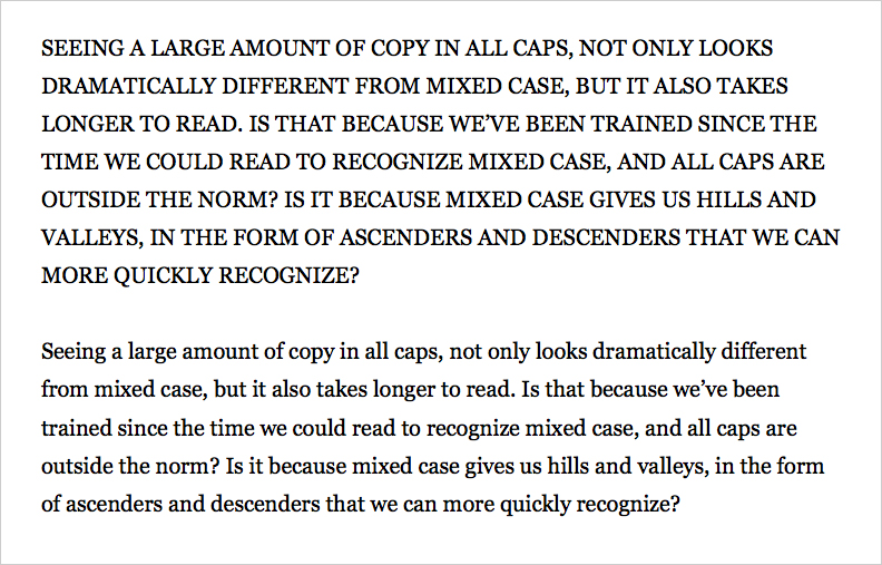
Image source: Punching Up Web Typography with Capital Letters
“If you make everything bold, nothing is bold”
As famously stated by Art Webb. :-)
As with capitals, the same goes for making a big chunk of text bold. By making everything bold there is no more differentiation in the text than before. Use a bold style only to highlight the words that are meant to stand out. Otherwise nothing will...
The same is true of italics. Use them with caution as adding slanting to your text actually makes it harder to read from a distance. Remember any emphasis you add to the text should make it easier to read and the important message pop.
Let you text breathe
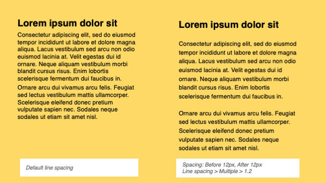
One thing that is often overlooked when creating PowerPoint presentations is setting proper text spacing.
This refers to paragraph spacing (remember passive white space?) that is giving the text block enough margins so it looks visually separate. Proper spacing plays a big role in setting the hierarchy of the page, helping the reader access the content in the desired order.
 line-spacing , or so-called 'leading'. This feature can be found under Home menu > Line Spacing icon > Line Spacing Options.
It is also about adjusting
The change doesn't have to be drastic - often a subtle change in the range of 1.1 to 1.3 can really improve the readability of the blocks of text on the slide.
Bullets and line length
Using bullet points is one of the classic PowerPoint techniques, and no doubt you have used it over and over again in your slides. They usually work fine but I encourage you to try using different techniques to make your slides stand out and easier to read.
Consider the two example below. Which is easier for your eye to follow?


Experiment with different layouts to make your point. Presenting your thoughts in text blocks and laid out columns with colourful icons, as opposed to bullet points, might be more attractive and easier to scan for the eye.
Also consider the line length of your text. Keep in mind that shorter lines are more comfortable to read than longer lines. Quite a typical error, when using the bullet points, is to make the font too small (trying to fit too much text on one slide) and hence making the lines of text too long, making them exhausting to follow for the eye. As a rough guideline, show up to 8-12 words or about 45–90 characters (including spaces) per line.
If you have no time to make it fancy, try changing the bullet colour or using a different shape bullets to add interest. You can also change the bullet you are talking about at that particular moment in your presentation to highlight your point.
I hope these few typography tips will help you make your presentation a success every time. In the next chapter, we will look at how to use colour effectively in order to improve your PowerPoint presentations.
--------------------------
More useful reading:
How to use WHITE SPACE to make your PowerPoint slides look less rubbish
, by Gaya Gajewska
7 Ways to Create Better Typography for your PowerPoint Presentations
, by Ashish Arora, Sketch Bubble
Choosing the Best Font for PowerPoint: 10 Tips & Examples
, by Design Shack
, by Presentation Process
Speaking PowerPoint Blog - Text
, by Bruce Gabrielle
How to improve your typography skills
, by Dave Smyth
Words remain the glue that ties information together. Because of this, good typography is as important -- if not more so -- than any visual element in a presenter's PowerPoint file.
http://www.readabilityformulas.com/articles/better-typography-and-more-readable-text.php
 unknownx500
/Passle/53d0c8edb00e7e0540c9b34b/MediaLibrary/Images/50f7dfcdd44fb153b05420f0/2023-06-22-14-12-33-947-649456d11f170f4787c17956.jpg)


/Passle/53d0c8edb00e7e0540c9b34b/SearchServiceImages/2022-05-12-15-54-32-158-627d2db8f636ea15f8071da1.jpg)


